Screenshot of the Pocket Tailwind UI template. The header contains the Pocket logo, main site navigation, and 'Log in' and 'Download' buttons. The hero section contains an introduction paragraph and call-to-action buttons to 'Download' or 'Watch the video'. Below that is a collection of company logos representing the publications that the Pocket app has appeared in. On the right side of the screen is a mobile screenshot of the Pocket app.
Technologies
Tailwind CSS, Next.js, React
Date
Go to website

Pocket

An awesome landing page template by the Tailwind CSS team.

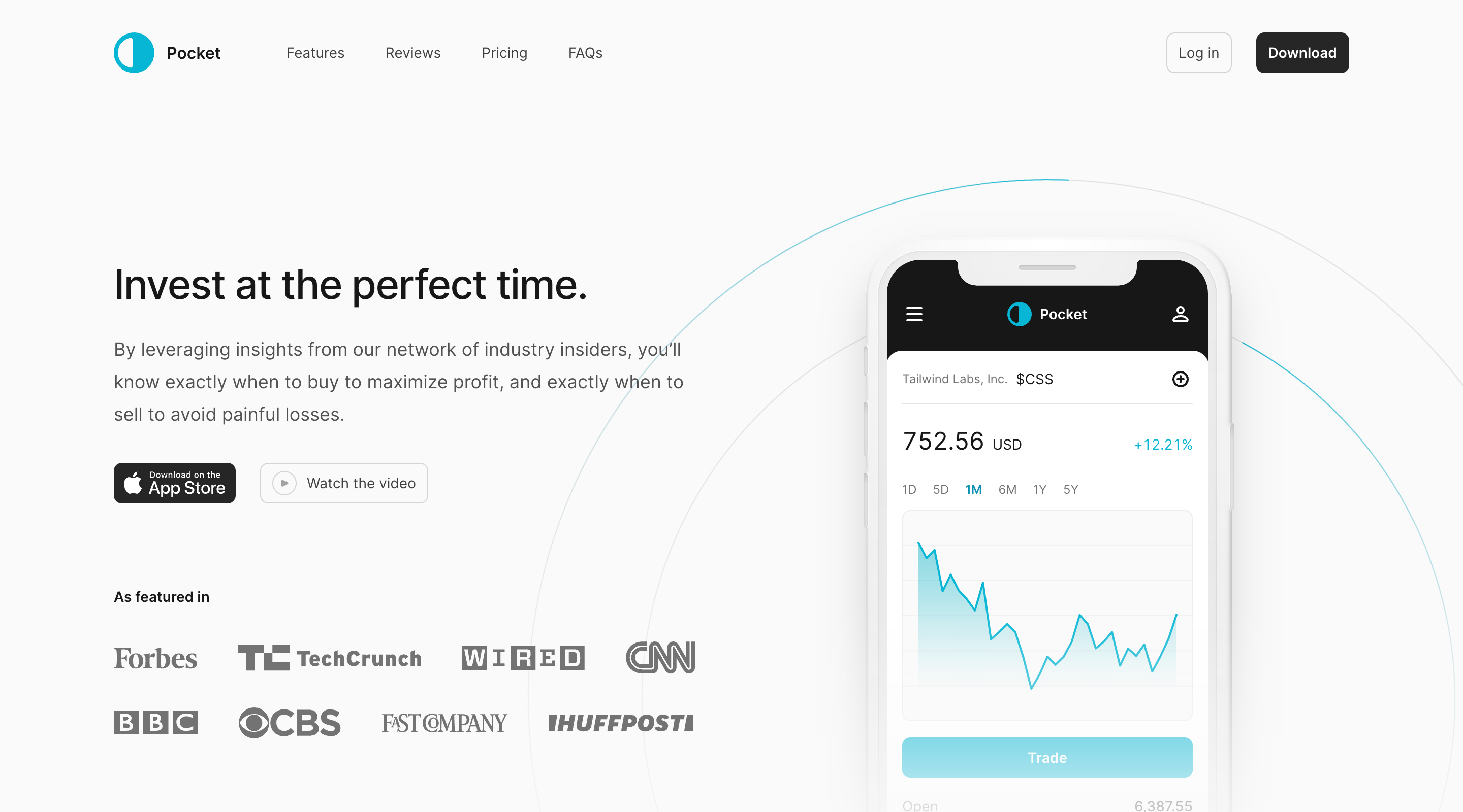
Pocket is a beautiful mobile app marketing template built with Tailwind CSS and Next.js, designed and built by the Tailwind CSS team. It’s production-ready and easy to customize, making it the perfect starting point for your new mobile app website.

Use this template for your own website →

Screenshot of the Pocket Tailwind UI template. On the left side of the screen is a screenshot of the Pocket app. On the right is a list of app features, each with a small icon and description paragraph.
Feature section with an app screenshot on the left and three highlighted features on the right. Clicking each feature updates the app screenshot.
Mobile screenshot of the Pocket Tailwind UI template. The header contains the Pocket logo and a menu button. The hero section contains an introduction paragraph and call-to-action buttons to 'Download' or 'Watch the video'. Below that is a mobile screenshot of the Pocket app.
Mobile screenshot of the pricing section of the Pocket Tailwind UI template. There is a section heading and introduction paragraph, followed by a time period button group with the options 'Monthly' and 'Annually'. Below is details on the 'VIP' plan including a price, description, list of features, and a 'Subscribe' button.
Mobile screenshot of the Pocket Tailwind UI template navigation popover. The popover extends over the page content from the top of the screen. At the top is the Pocket logo and a close button. Below is a list of site sections, and then larger 'Log in' and 'Download the app' links.
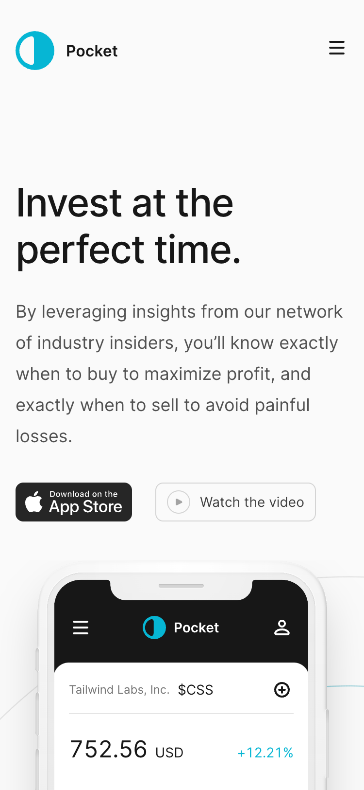
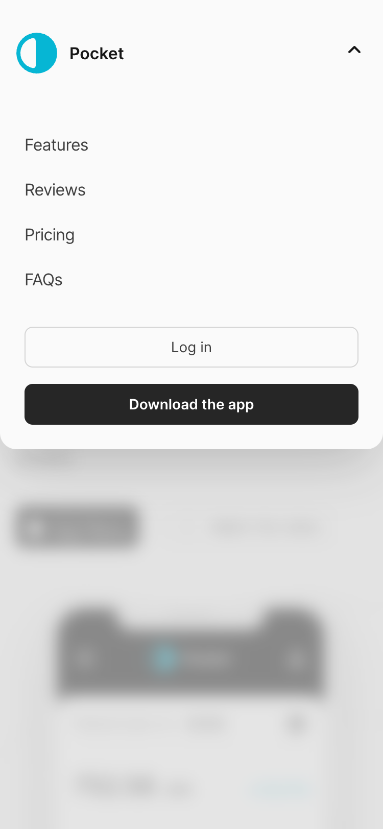
The Pocket template experience on mobile devices, including what the site navigation looks like.
Screenshot of a features section from the Pocket Tailwind UI template. The section has a heading and short introduction paragraph. Then features are listed in a grid layout with three columns and two rows. Each feature has a title, short description, and stylized icon.
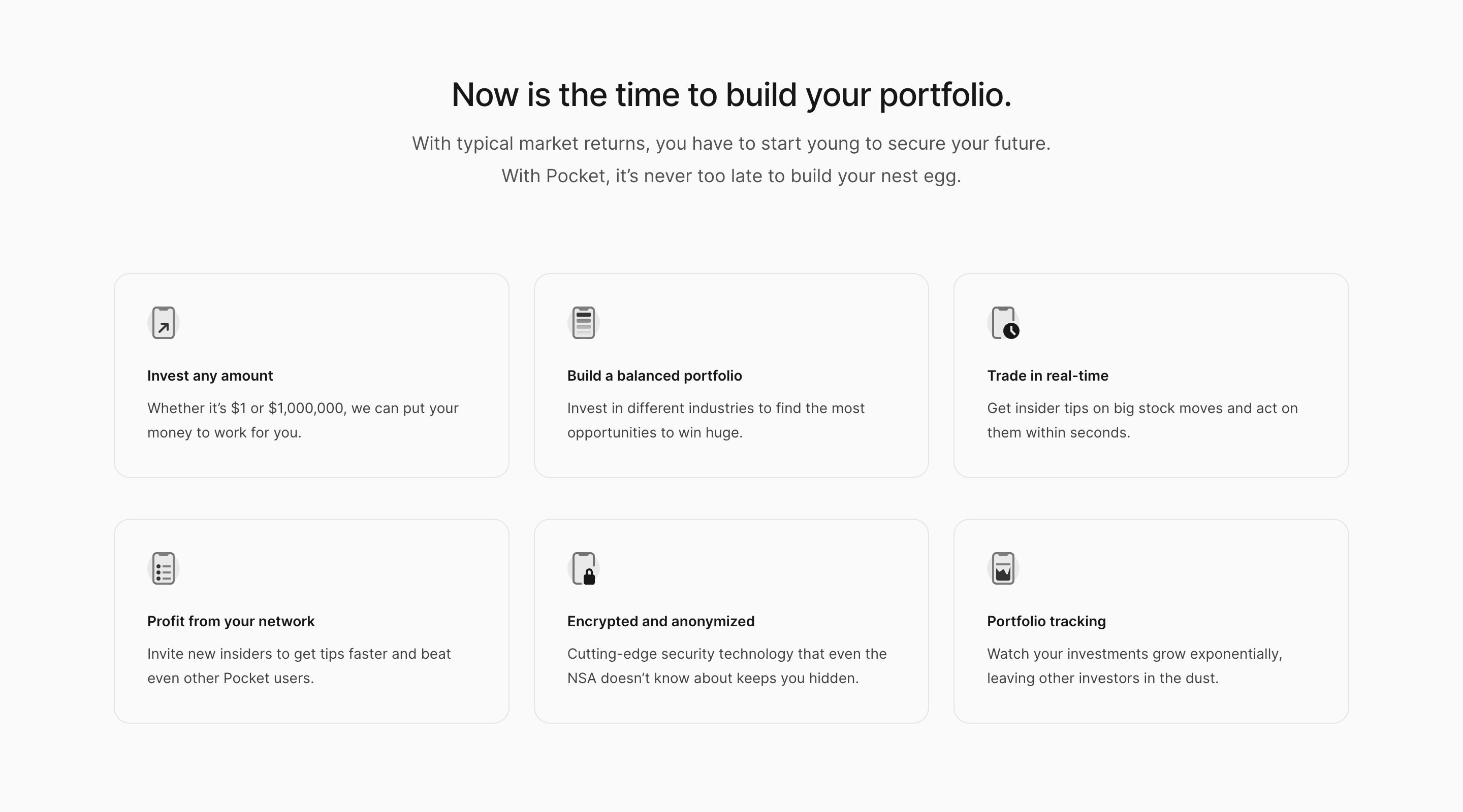
Feature section with a six-by-two grid highlighting different features of the mobile app.
Screenshot of the pricing section of the Pocket Tailwind UI template. There is a section heading and introduction paragraph, followed by a time period button group with the options 'Monthly' and 'Annually'. The pricing plans are arranged in three columns. Each plan has a name, price, description, list of features, and a 'Subscribe' button.
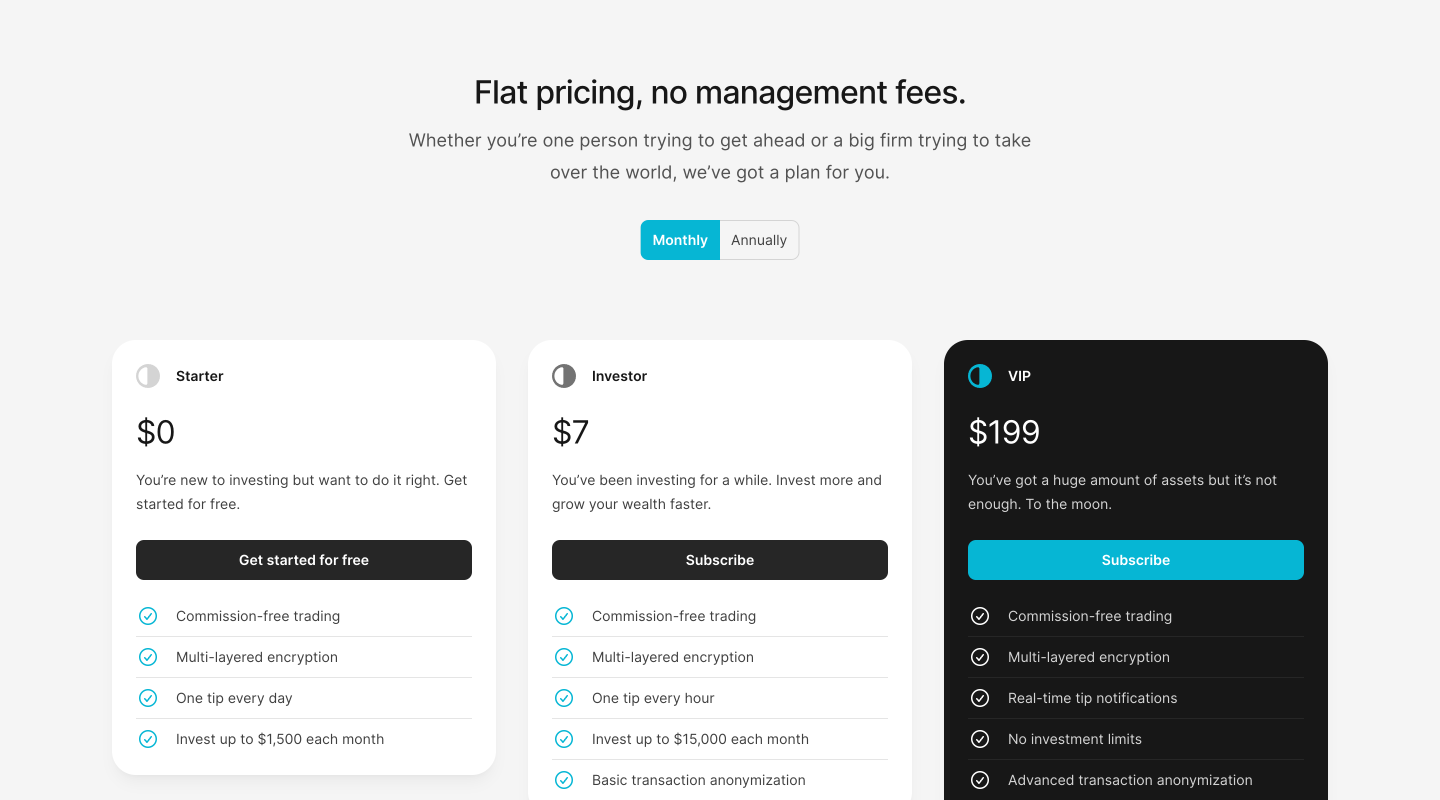
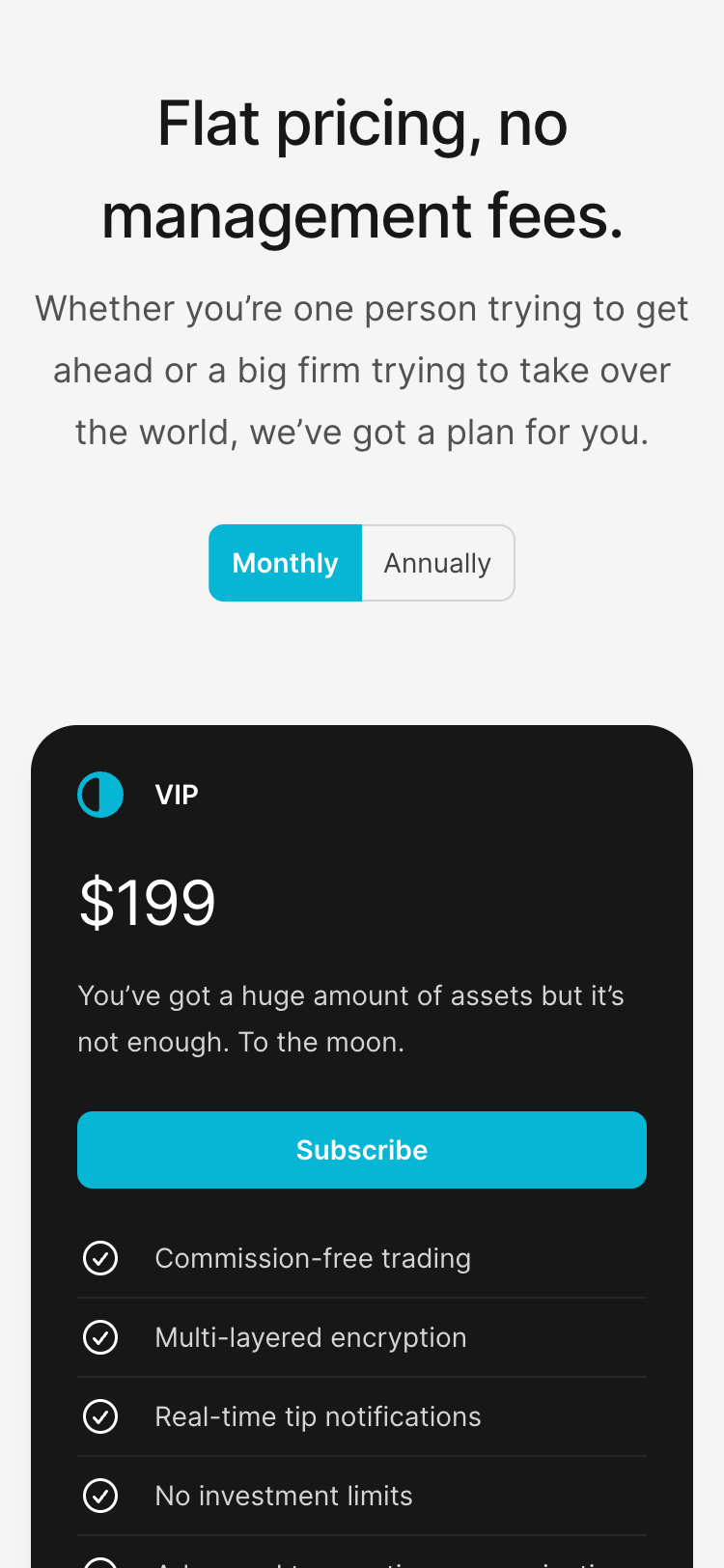
Pricing table with three price tiers and a toggle to switch between monthly and annual billing.